Overview
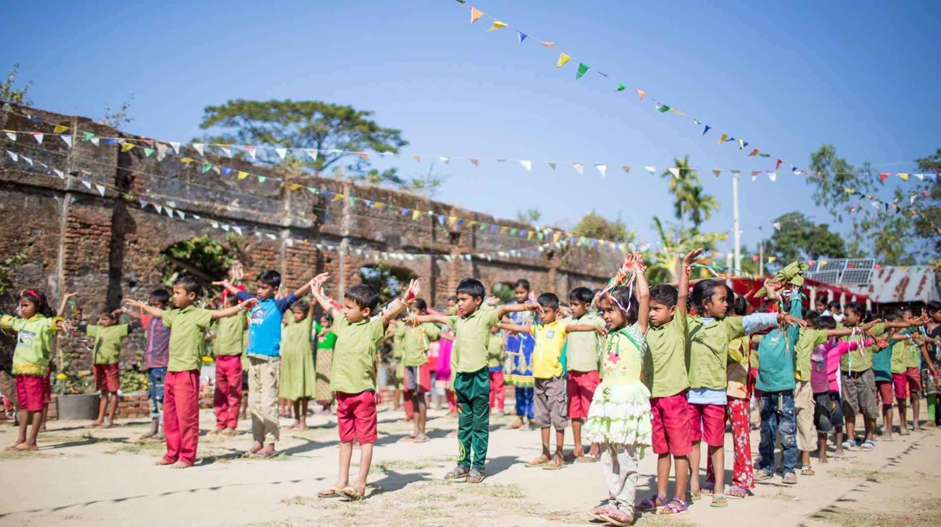
Swapnanagar Bidyaniketon is a school in a rural area of Bangladesh, named Dherrapara. Before the school was established, children of this community were rapped in caste-based discrimination and hopelessness either by being involved in child labor or chained in child marriage. These kids were not allowed to go to schools in nearby neighborhoods. The school was formally initiated in 2009 by a like-minded group of people and is currently run under the society registered as Swapnanagar, and from then the school has been growing in its own way. The school attracted students from other communities by providing better education and facilities and eventually eradicated the caste-based stigma in the village. The villagers changed the name of the village to Swapnanagar (meaning "dreamland") after the school was established. The school's website was in need of a complete redesign in order to attract local and foreign donors to support the cause
The Challenge
Capturing the Story
Capturing the Story
Our goal for this project was to highlight the compelling story of this school and motivate kind-hearted people to support the kids by donating for their education. The existing site had too many projects to share which made it difficult for donors to choose a cause to support.
Users & Audience
Prospective donors and potential volunteers.
Roles and responsibilities
I led the redesign of the Swapnanagar website from June 2019 to July 2020. There was one more junior designer and a developer on the team. In addition, we worked alongside a couple of executives from the school committee.
Scope and Constraints
This was voluntary work. The design team had absolute freedom to explore new ideas and approaches. However, we were working on this in our spare time, and it was hard to keep motivated everyone at the same time. Despite all setbacks, we were successful to launch the new website in 2021.
The Process
Outline of work
- UX Analysis
- Contextual Inquiry
- User Interview
- IA and card sorting
- Design
-User testing
UX Analysis
• Too many call to action button
• Unorganized Navigation
• hard to differentiate different projects due to similar content
• Too many projects under the submenu
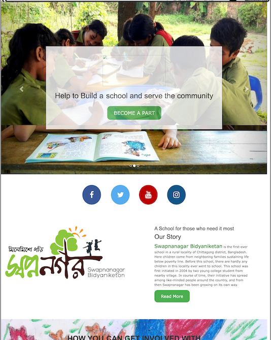
Old SIte -homepage Upper Section
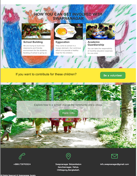
Old SIte -homepage Lower Section
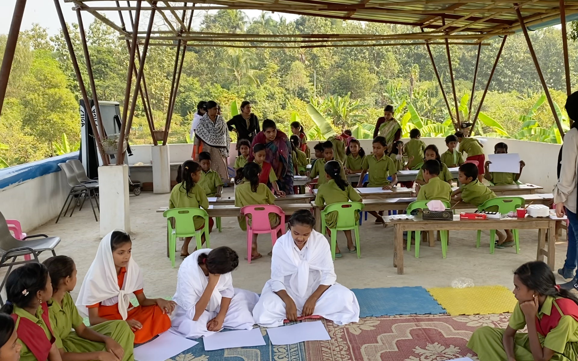
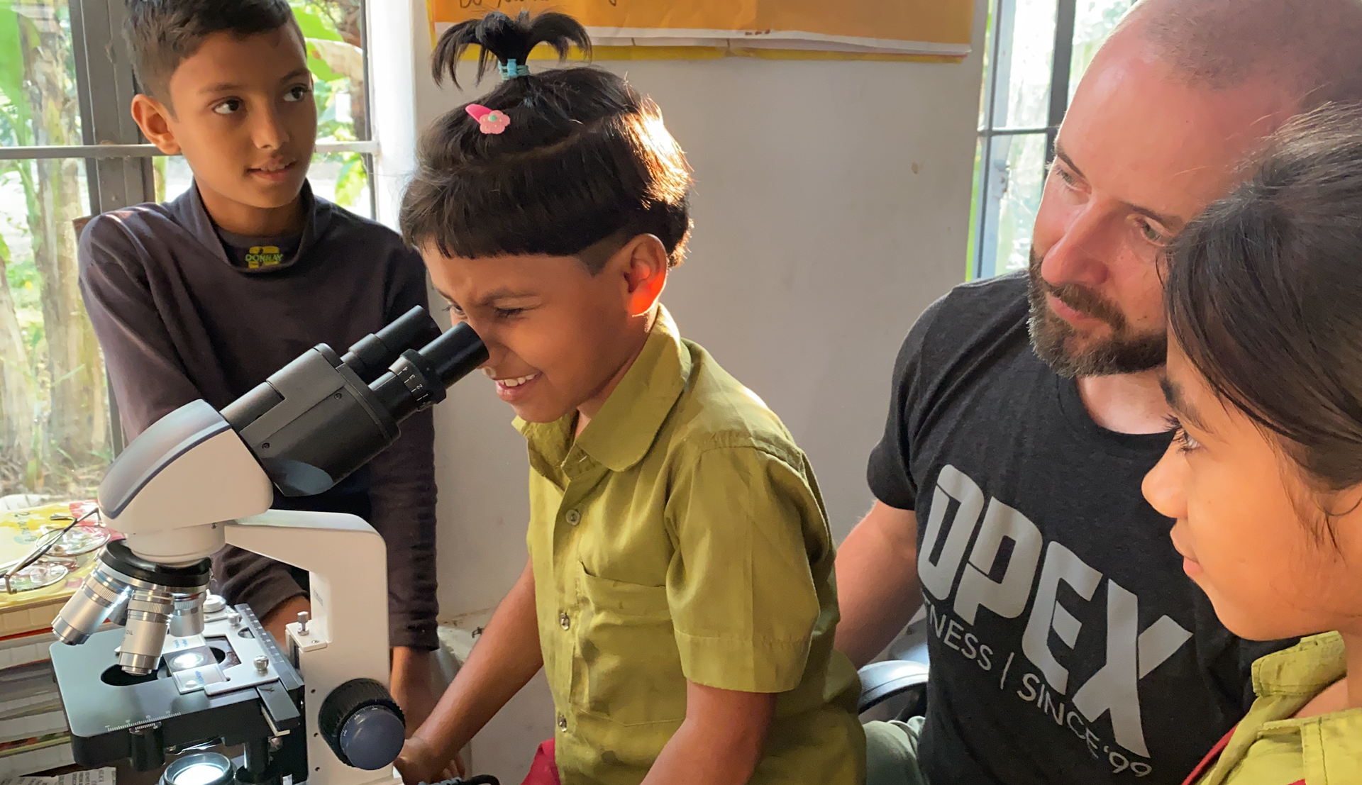
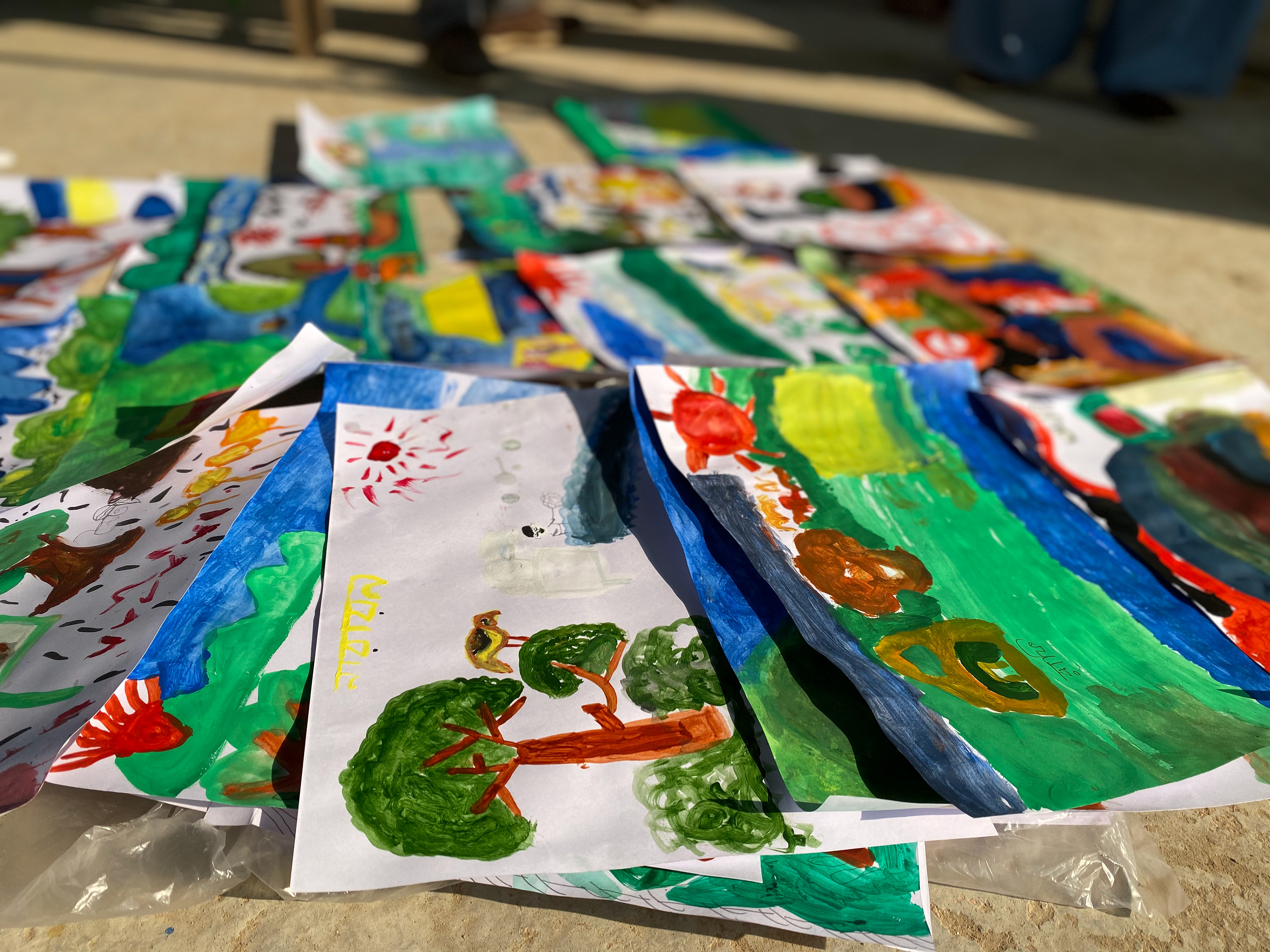
A Day in Swapnanagar
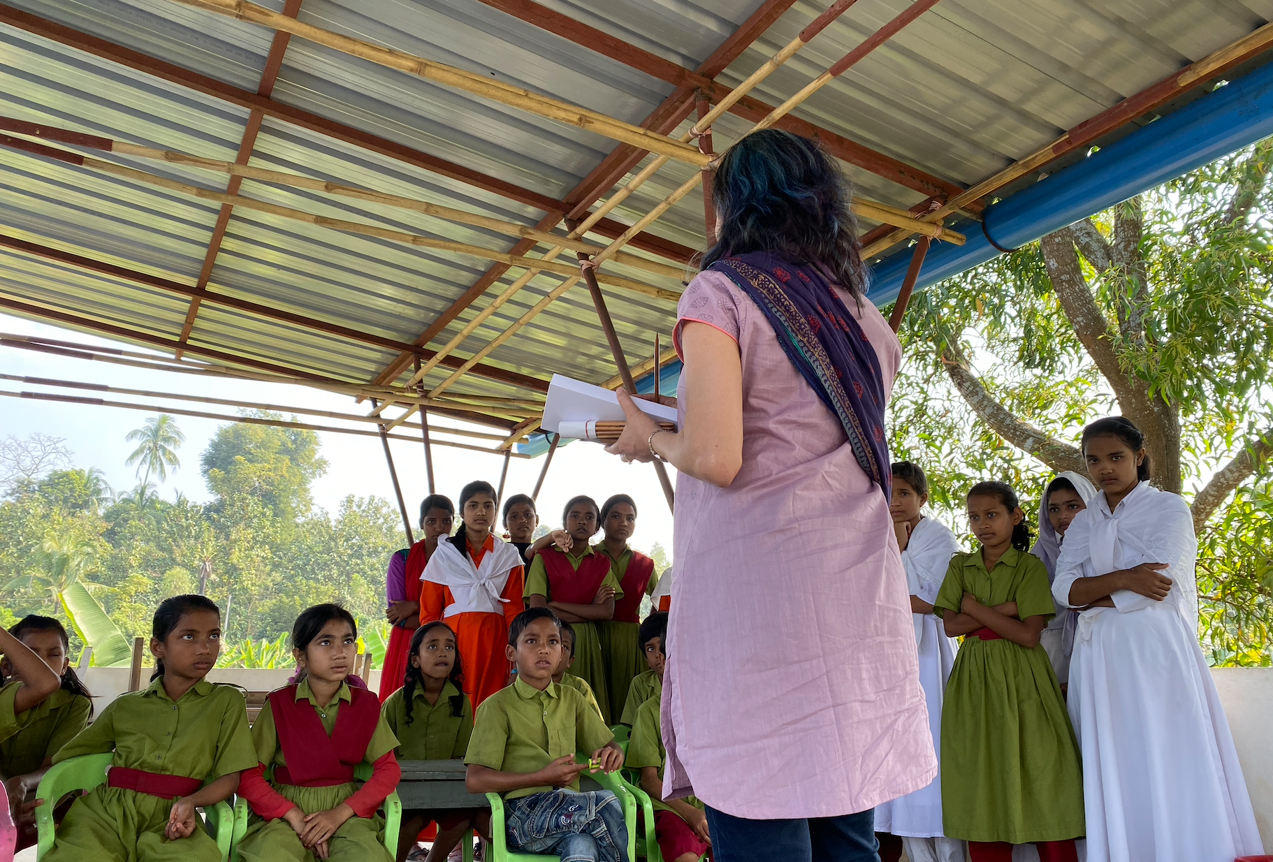
To gain a comprehensive understanding of the school, we visited the school on December 2019 and conducted a contextual inquiry into its operations. These findings were extremely valuable in guiding our design decisions. Some of our key observations included:
• Students attend school primarily for enjoyment and learning is a secondary benefit
• The current students are unaware of the caste-based discrimination and educational disadvantages related to poverty that existed before the school was established
• Students have the freedom to choose between indoor and outdoor classrooms.
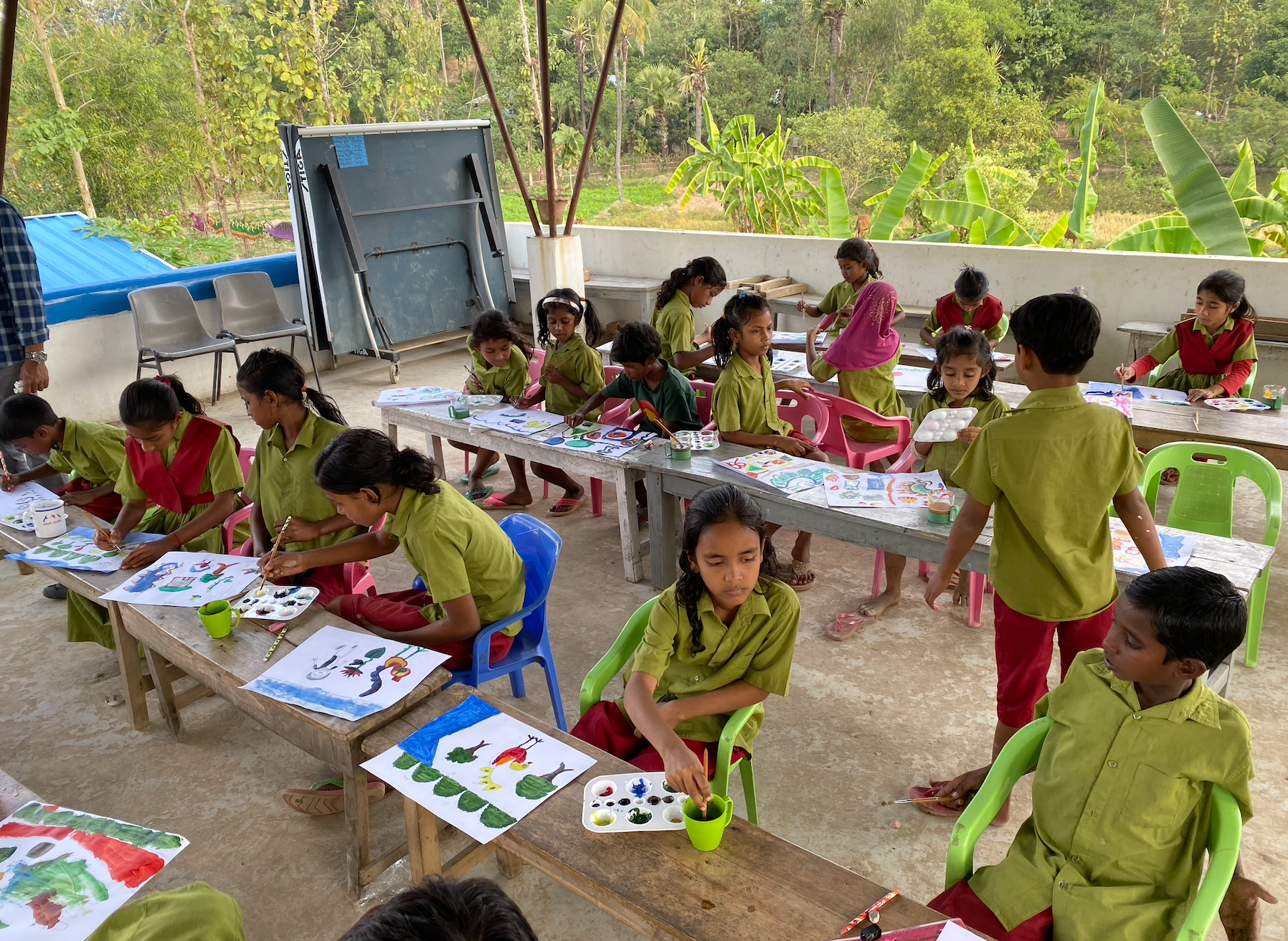

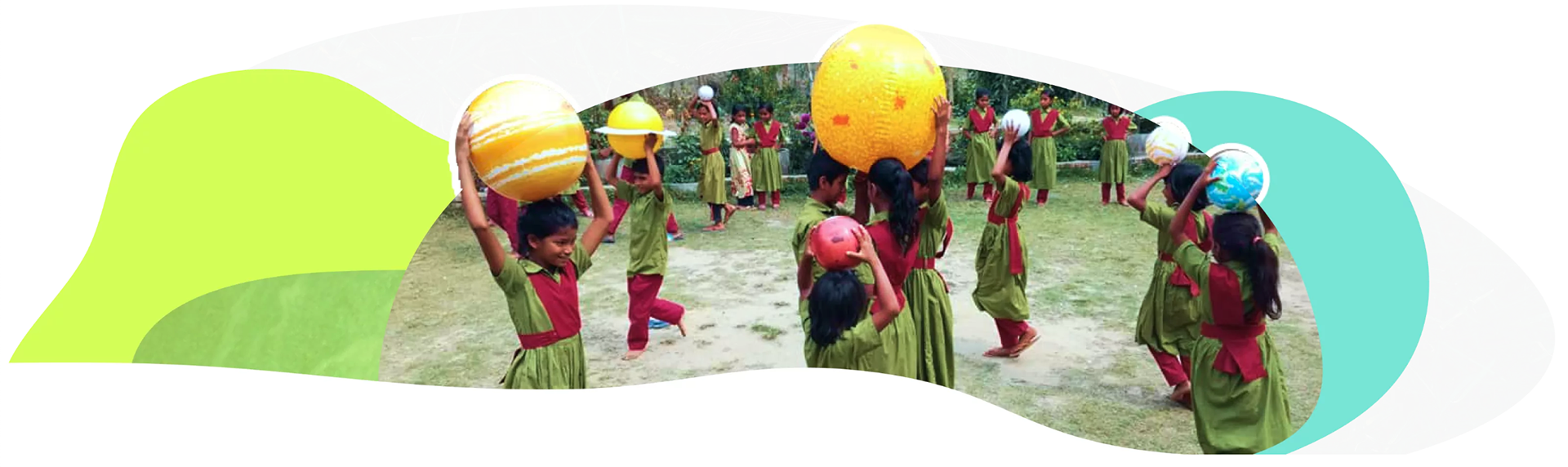
Students Learning Solar System
User Interview
We had interviews with donors and volunteers to understand what motivated them to participate.
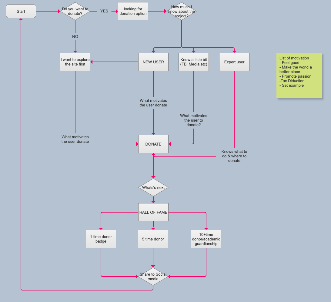
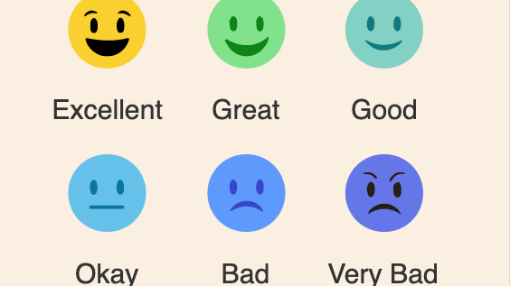
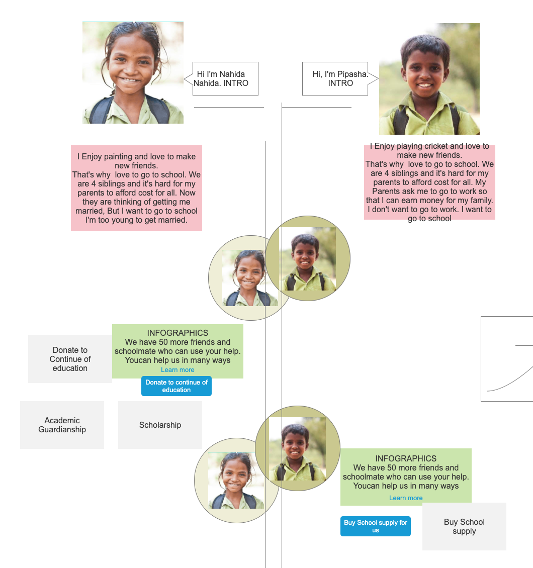
Donation Scheme based on User interview.
Information Architecture
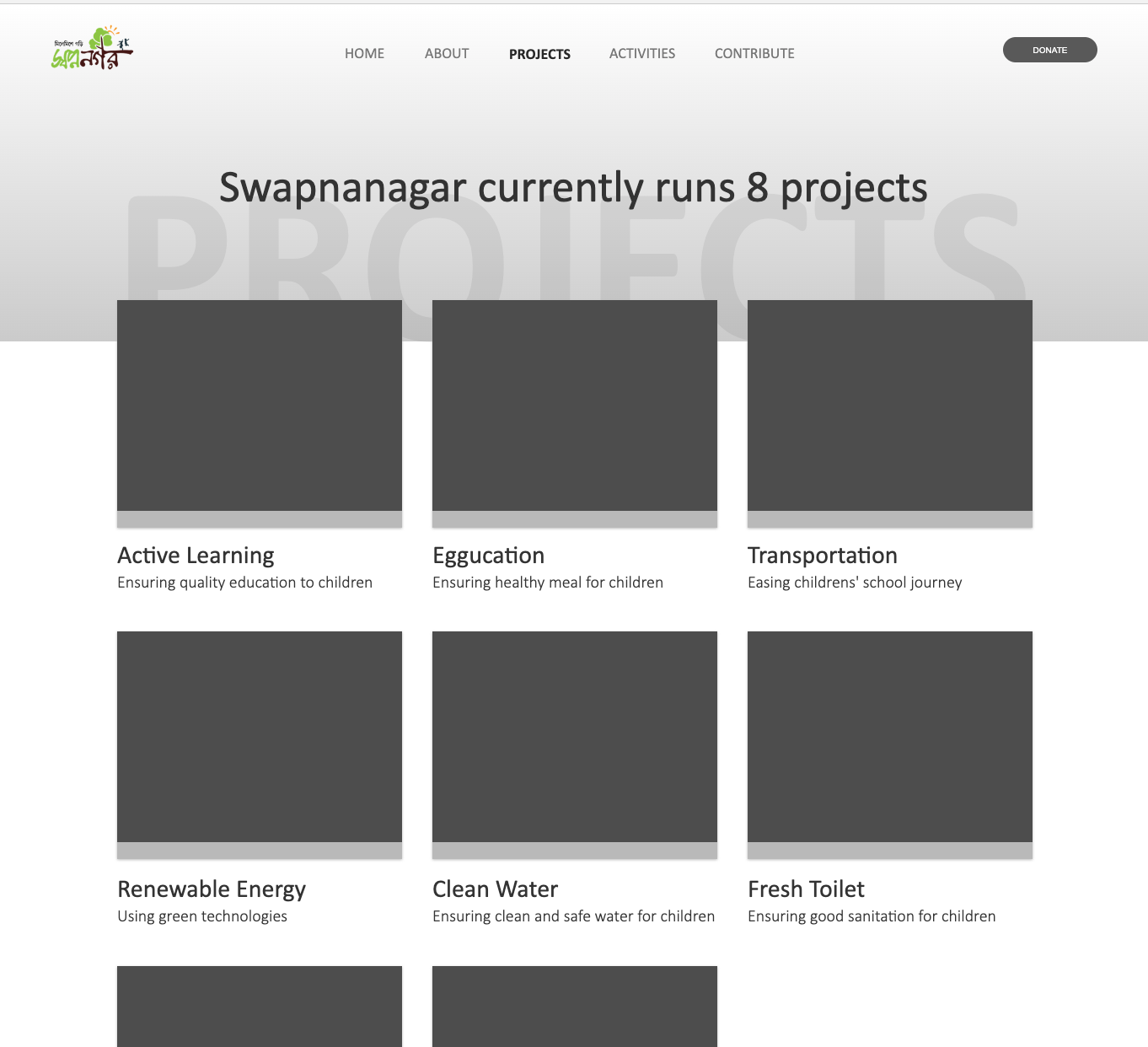
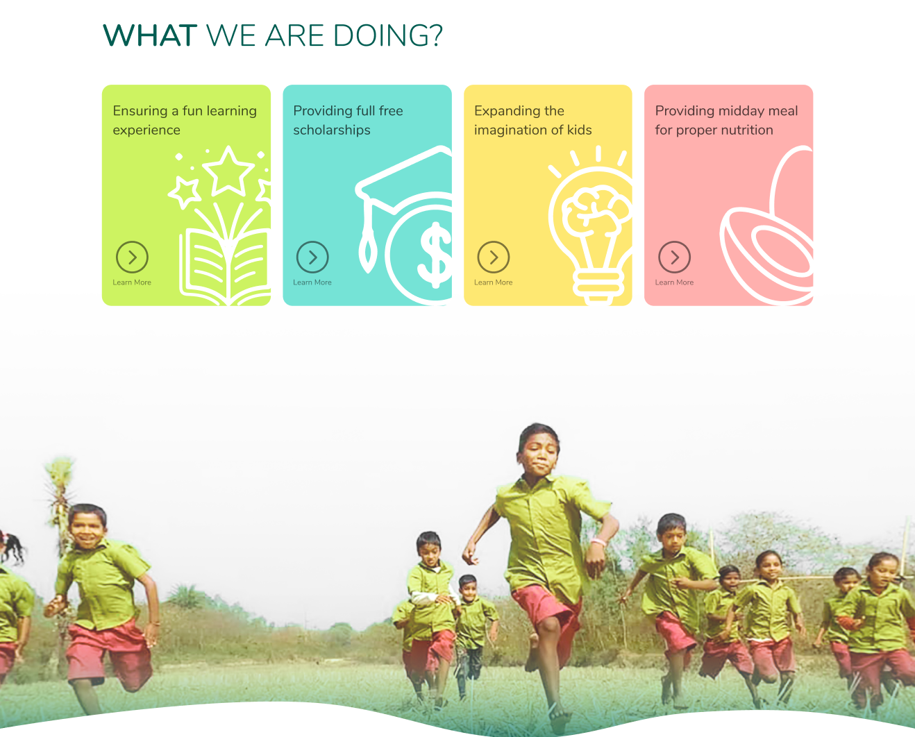
The existing website had 11 projects to choose from to donate. We applied Hick's law to make the choice easier. Major IA change was done when we regrouped all projects
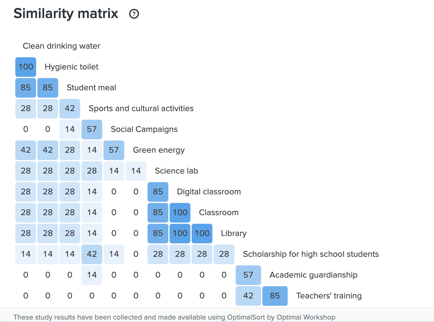
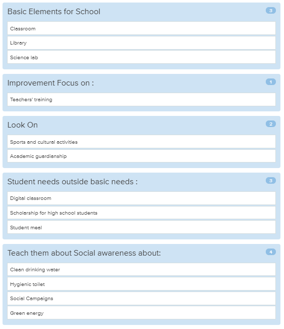
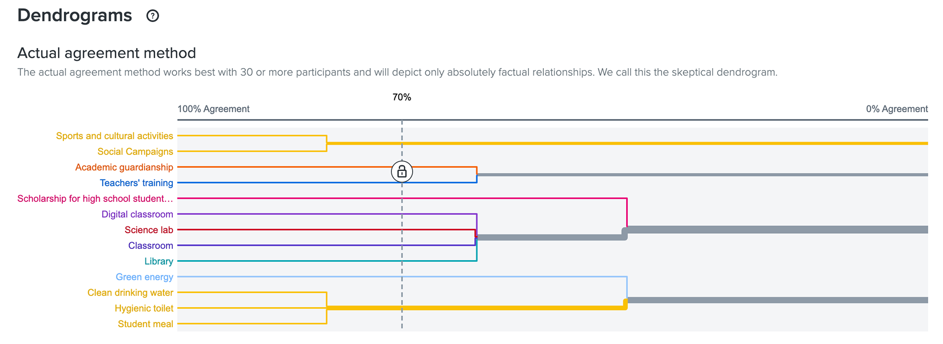
To understand how users discover the categories we performed open and close card sorting by using the OptimalSort tool. In Open card sorting most of the participants could not categorize the projects into one group. However, the similarity matrix helped us to simplify the projects into 4 main categories. It also helped us to identify blog content for the SEO and marketing purpose.
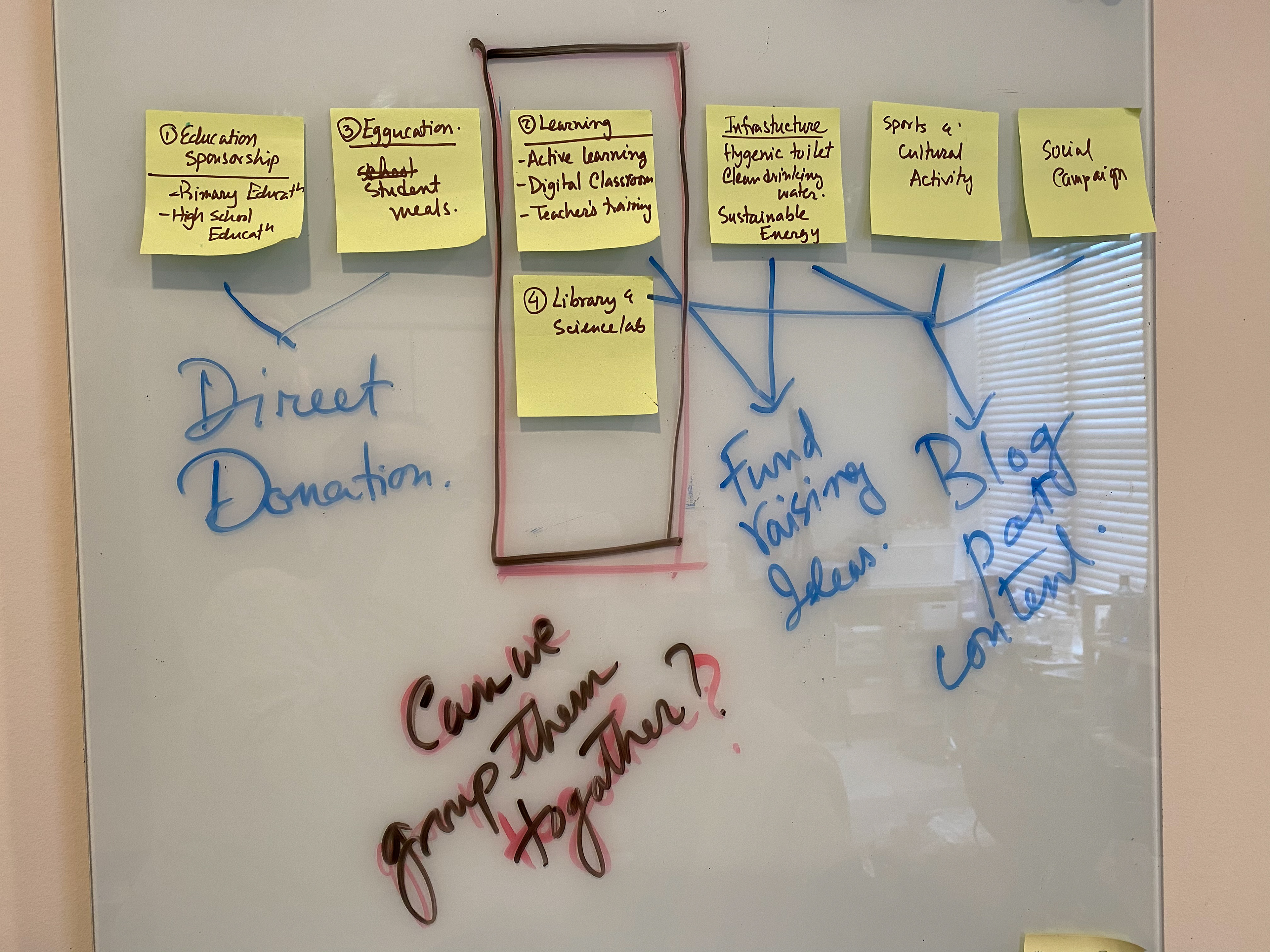
Simplifying IA
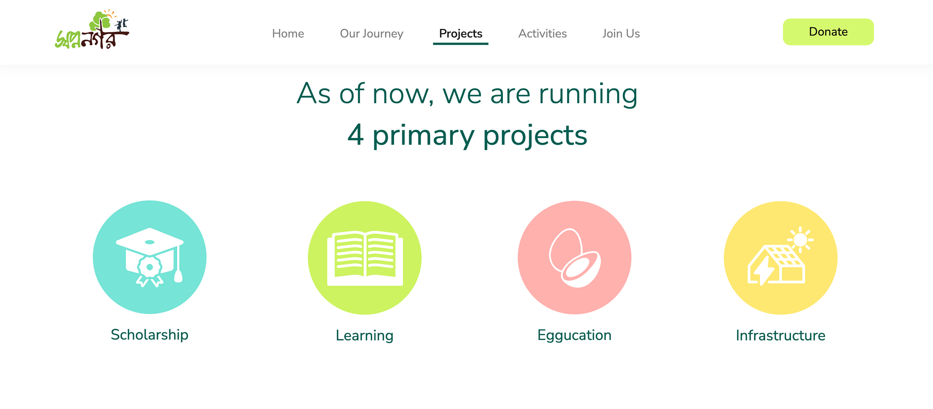
Final Projects
Design
Wire-framing & Prototyping
We went through multiple iterations of wireframing in order to test and explore different ideas. This approach proved to be efficient in quickly identifying the best solution within a shorter timeframe.
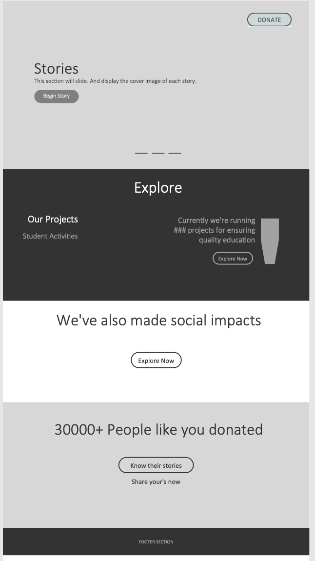
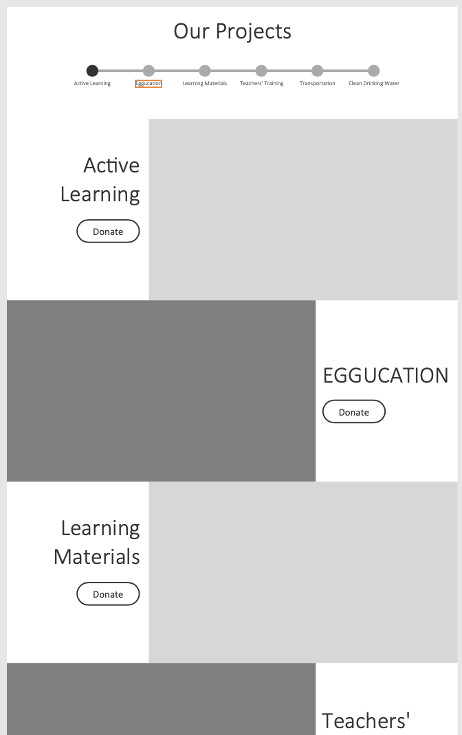
After finalizing the layout and information architecture, we focused on creating a high-fidelity prototype and continued to iterate and improve it through multiple versions.
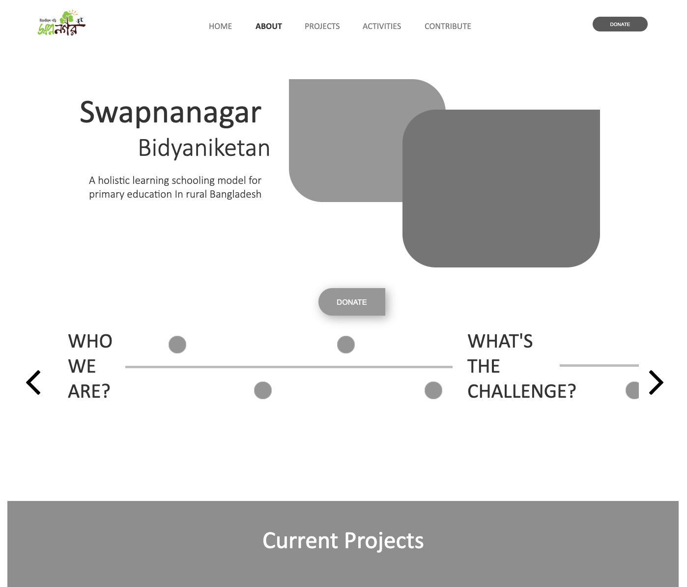
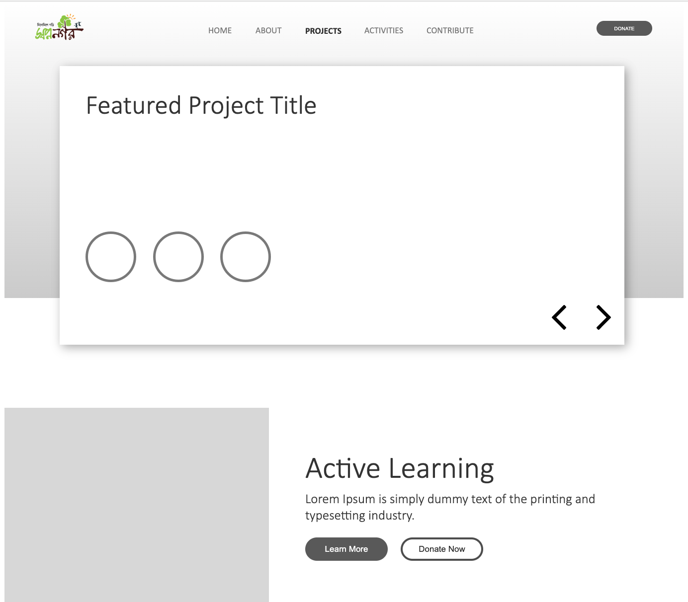
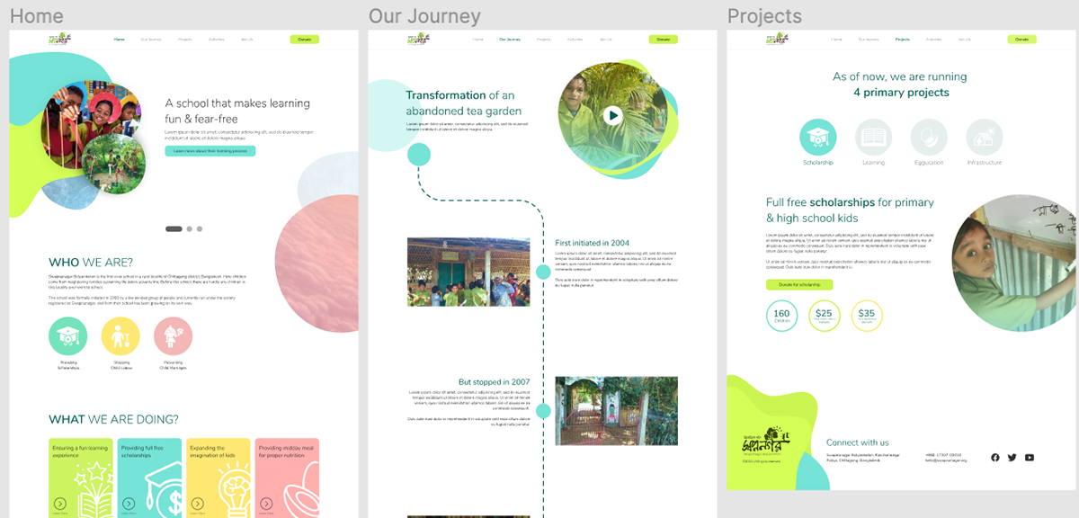
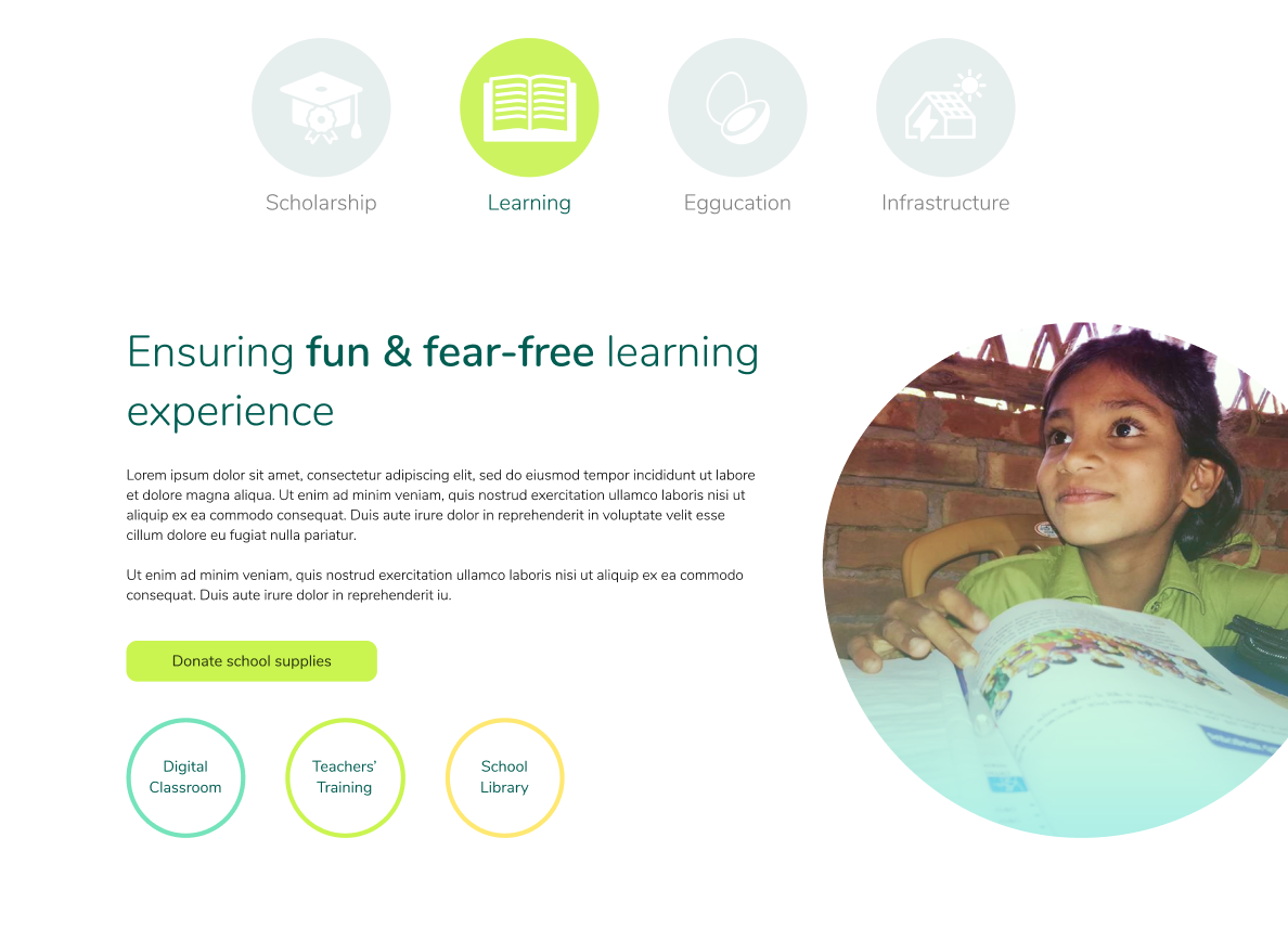
Final Design
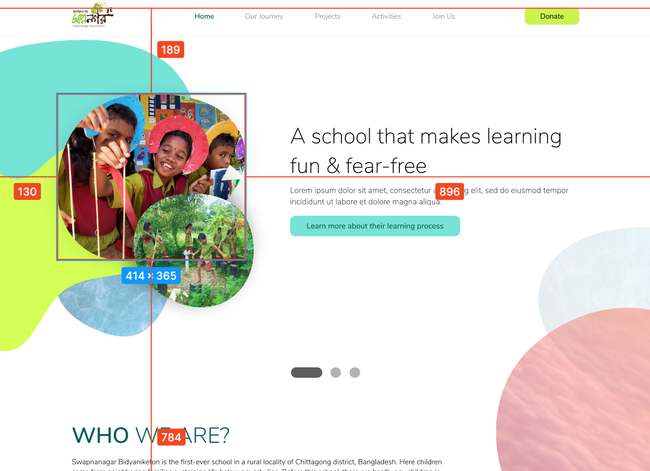
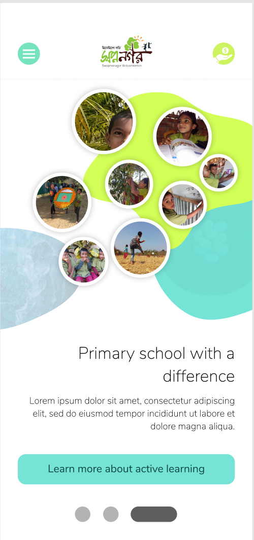
In the new design, we aimed to capture the lively atmosphere of the school and attract potential donors. We initially attempted to convey this through photographs but found that a traditional layout was not sufficient to fully showcase the limitless possibilities offered by the school in the digital realm. As a result, we decided to take a unique approach and incorporate graphics alongside photographs to reflect the school's flexible and adaptable approach to education. We believe that this approach aligns well with the school's culture.
Testing and outcome
We conducted a small user test with 5 participants to evaluate if the new design met our objectives. All participants were positive about the new design, praising the overall look and feel. They also found it easy to locate the donation button and noted that the process of making a donation had become more streamlined.
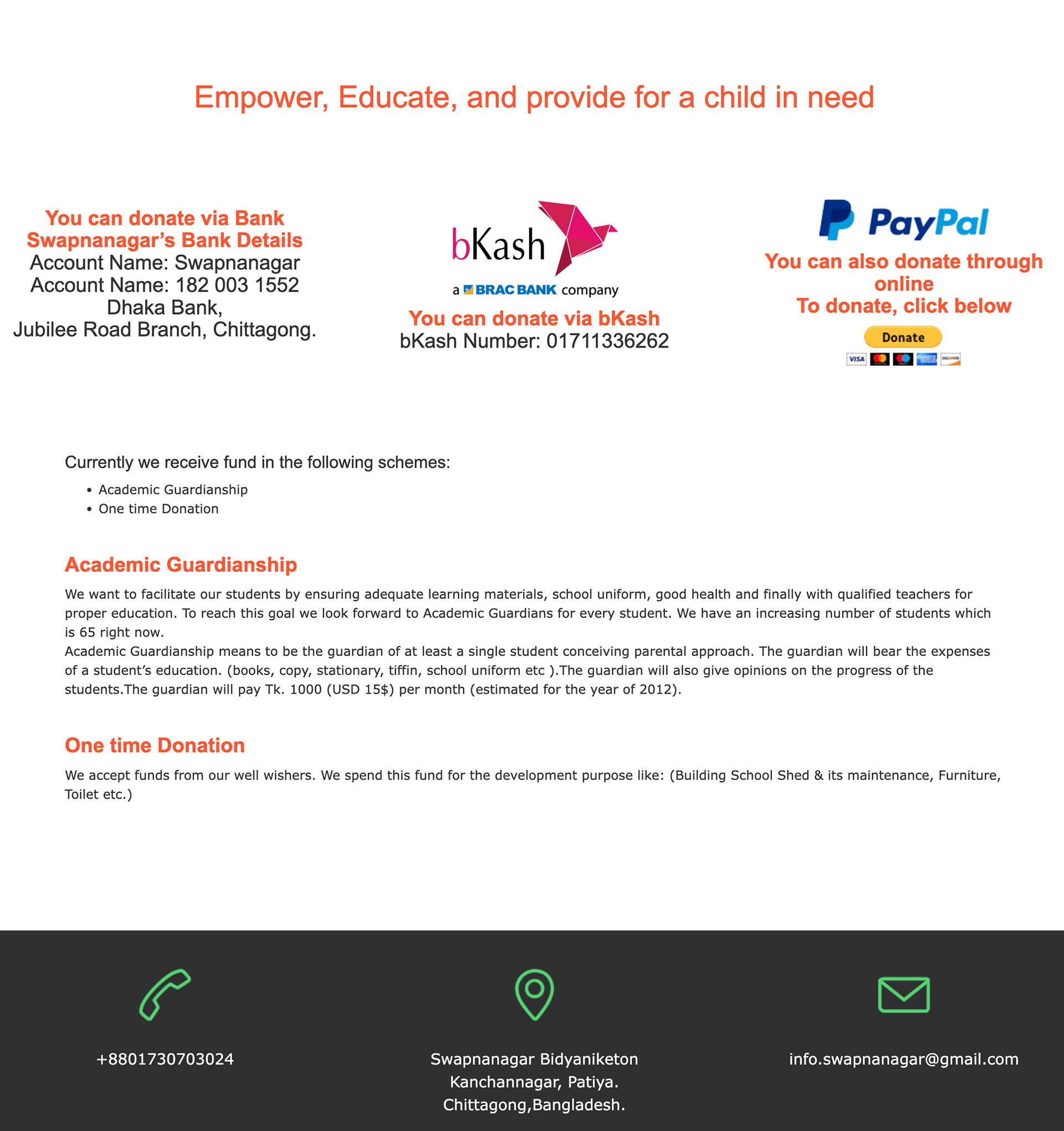
Old Donation Screen
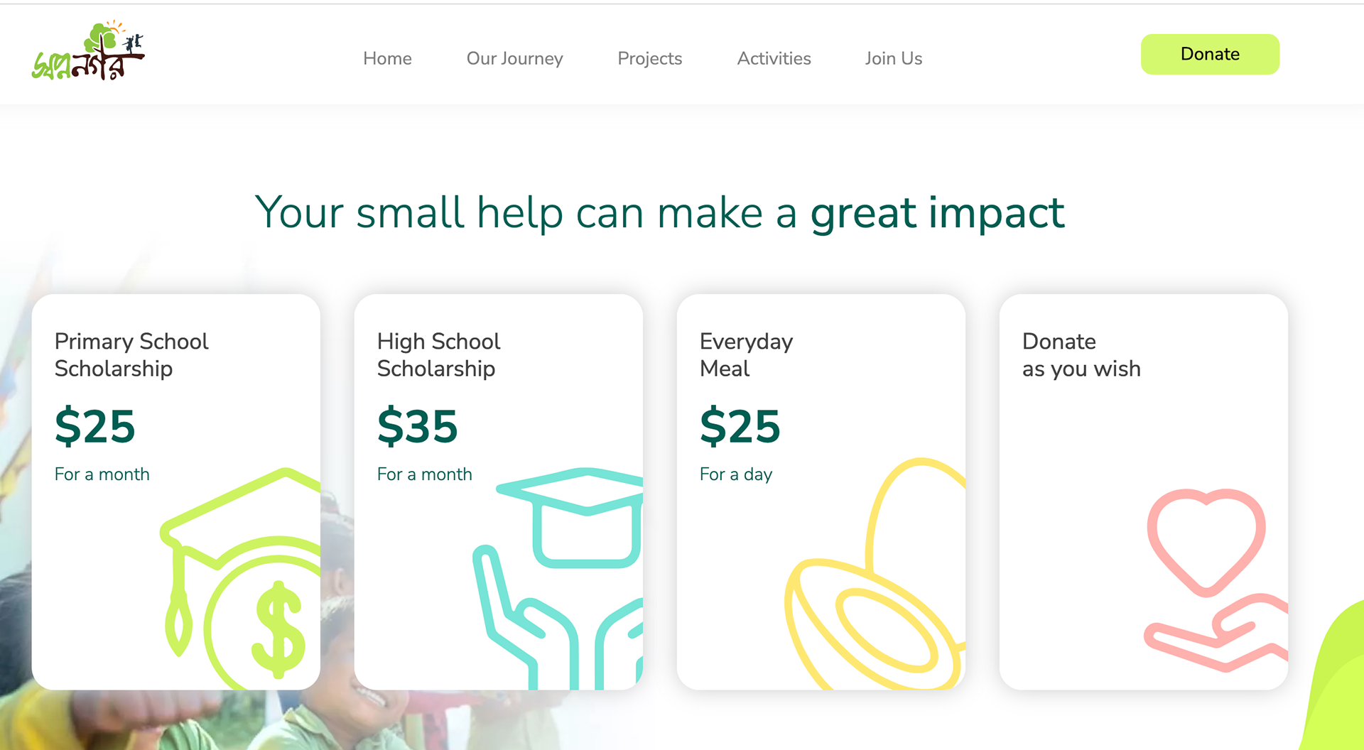
In the new design, we include the donation amount and purpose of the donation to make the decision easier for the donors. Donors found it super helpful.
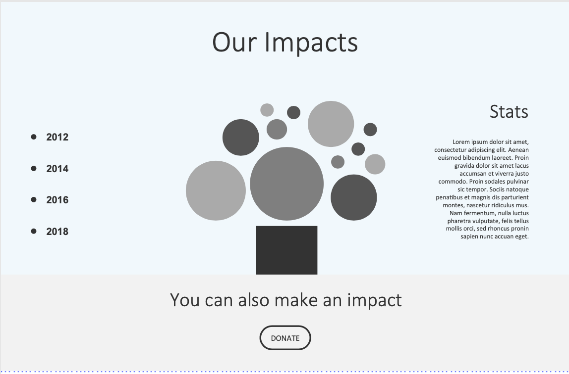
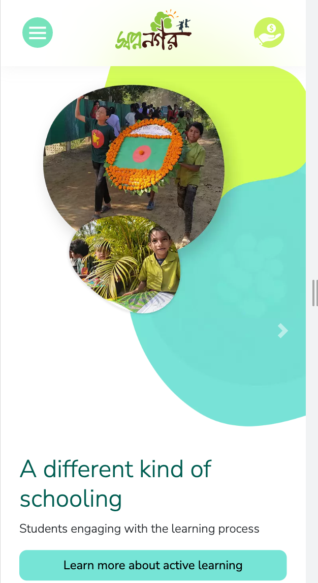
During user testing, we discovered that one of the graphics on the landing page may trigger trypophobia in some viewers. To address this issue, we modified the graphic and the layout of the images in that section.
Trypophobic Image
Replaced image
Reflections and Lessons
Working on this project was a fulfilling experience. However, being a volunteer project, it required a great deal of self-motivation and dedication. Despite this, we faced challenges, particularly in maintaining momentum due to competing priorities. In the future, I plan to approach similar projects by setting smaller, more manageable goals in order to stay on track and avoid delays.