Overview
Stock Screener was an integral part of Stansberry Investor ( formerly known as Stansberry terminal) from the very beginning of the platform. Due to its unique criteria like SR (Stansberry Research) proprietary indicators and publication recommendations to find stock, it always had a demand among B2C and B2B users. However, the fundamental usability of the entire platform was challenged. Despite useful features and continued enhancement users struggled to use the tool. The application performance issue increased to a point that the tool needed a major overhaul.
The Challenge
Simplifying screening criteria

Our goal was to simplify the stock screener platform and make it more user-friendly by reducing the number of criteria and making it easier to navigate. The old design was confusing and difficult to use, so we aimed to improve the experience and make it easier for users to make decisions quickly.
High-level goals included,
• Make the platform fast and easy to use for both business and consumer users,
• Improve accessibility and understanding of screening criteria to aid in finding suitable stocks, and
• Provide a platform for further innovation and engagement.
Users and Audience
The application is for both B2B and B2C users who are into a long-term investment strategy.
Roles and Responsibilities
I was in charge of redesigning the Stock screening experience in 2020. I had different roles such as researcher, analyst, and designer. I did user interviews, testing, research, and design work and collaborated with other teams like sales, financial analysts, developers, and customer service. The final design was completed and handed over to the development team in June 2022 after usability testing.
Scope and Constrain
As the sole designer on the team, the project I was working on faced multiple setbacks due to competing priorities and a shortage of necessary resources such as subject matter experts and development support. Despite this, I took advantage of the lack of a set launch date to establish a previously non-existent UX process. I took the initiative and self-directed a lot of the work to overcome the challenges that arose.
The Process
Outline of Work
- Heuristic evaluation of the existing product
- User research such as user interviews, contextual inquiry, competitive analysis,
- End-to-end UX analysis, information architecture, content strategy
- Designing low and high-fidelity prototypes, visual design
- Usability testing and finalizing the design
Heuristic Evaluation
Major issues- Visibility of system status, error prevention, recognition over recall, user freedom
Visibility of the system status
Error prevention
Recognition over recall
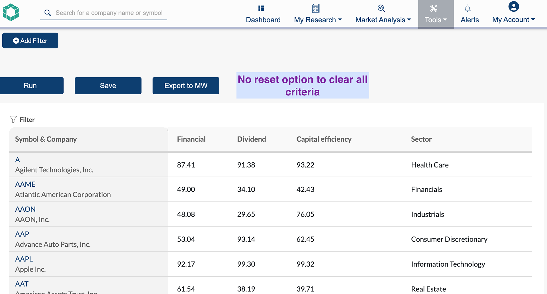
User freedom
Information Architecture
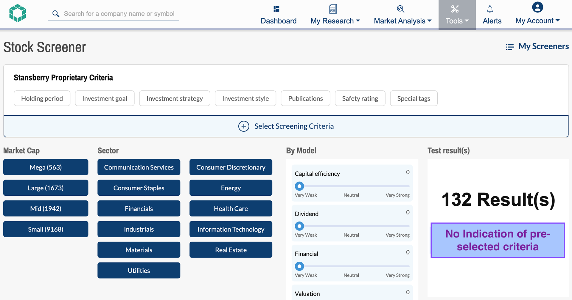
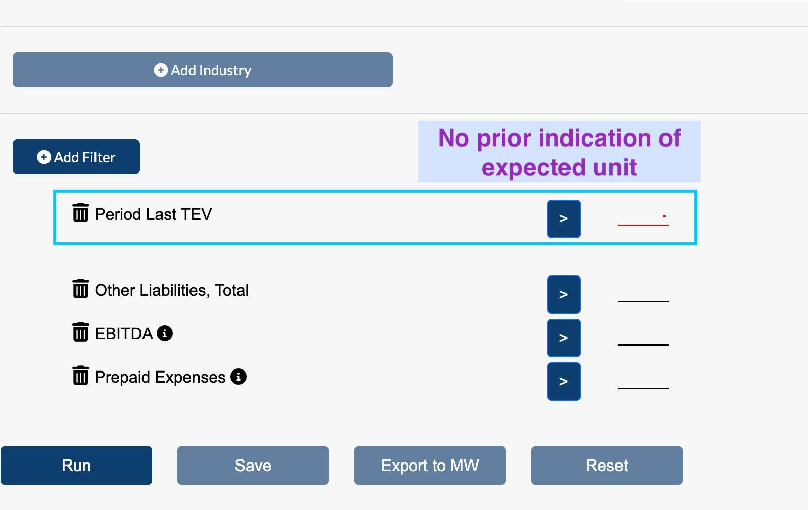
No Structure - Lack of Organizing principle for individual items
Poor searchability -Search and structure not integrated
Adding filter view (4x faster than normal speed)
Competitive Analysis
Fidelity Investments - Total 150 criteria in 11 categories
FINVIZ - 67 criteria in 3 catagories
Seeking Alpha - 100 filters in 15 categories
Yahoo Finance - 9 types of screeners with different sets of filters
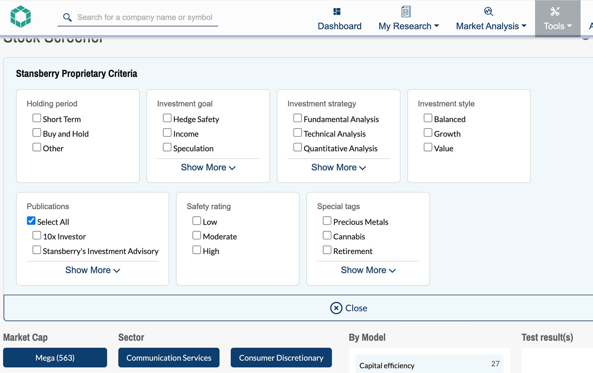
Stansberry Research Screener - 230+ Screening criteria under one filter
FINDINGS
Early Insights from User Interviews
Our goals were to understand the challenges personal and professional investors encountered and the workarounds they employed while using stock screener. We found that
- Investors get frustrated by not finding the desired criteria easily.
- The filter input needed to be more specific to generate useful results. However, this often resulted in unexpected and frustrating error messages.
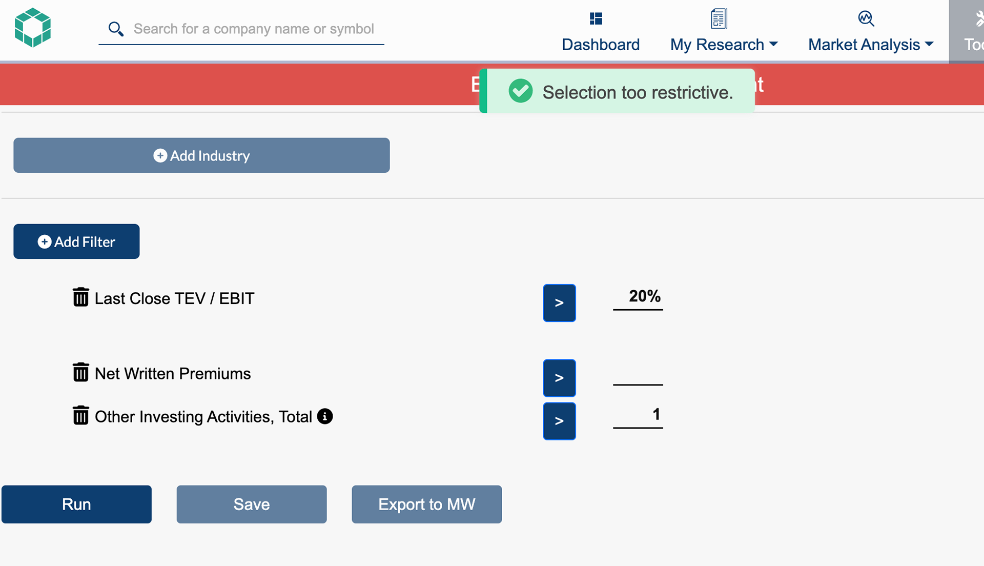
Confusing Error message
Criteria that did not work well
- Investors typically use a limited number of criteria that align with their investment strategy and find advanced filters offered by professional advisors unnecessary. The lack of personalization options causes users to seek out alternative tools from competitors.
- Individual investors who are new to developing their strategy find it challenging to use the screener as there is no educational support to assist them in learning how to use it.
Insight from Analysts
We discovered a problem with the current information architecture, which lacked organization and was based solely on S&P and GICS data. I work with financial analysts to identify useful criteria for investors. After consulting with financial analysts, it was found that 80% of the financial data displayed as filters were not important for investors and were mostly used by accountants. Additionally, important criteria were found to be missing and needed to be calculated based on S&P data.
THE SOLUTION
Restructure Information Architecture
Our first course of action was to find out important criteria for individual and professional investors. After a series of grouping and sorting, we ended up with 101 filter criteria in 7 categories for B2C users and additional 32 advanced criteria for B2B users. We also identified missing data that needed to be calculated and add to the new IA.
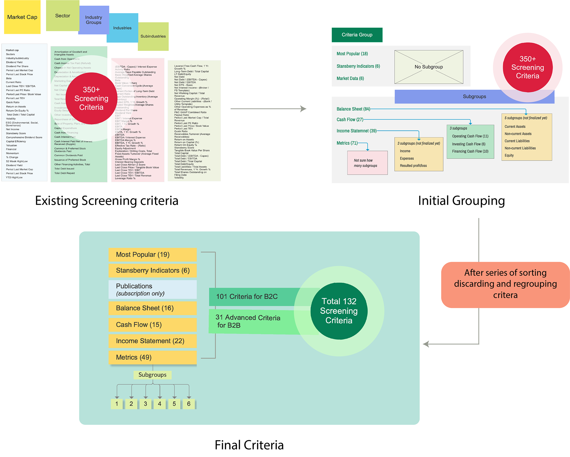
Finalizing Screening Criteria
Interaction Design
Besides improving the IA, the new solution required an engaging interface with improved interaction design. Some of the design examples are as follow-
Increase the visibility of filtering criteria: The new design groups criteria into 7 categories to make it easy to scan and find what investors need. It also highlights the most popular criteria used by investors. The categories are laid out in an accordion format, allowing users to see the details with one click.
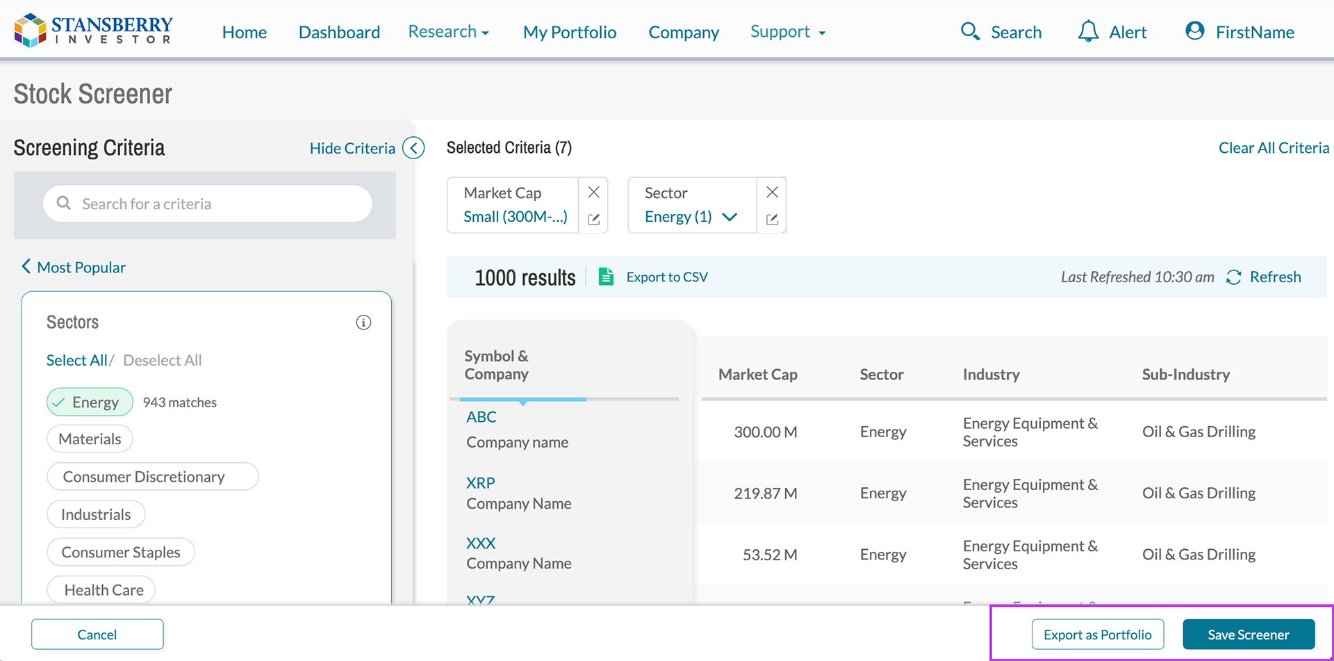
Visibility of Selected Criteria: The current screener design for investors is inconvenient because they have to scroll up and down to see and edit selected criteria. The new design improves this by showing checkmarks for individual and category levels of filters, as well as displaying the number of selected criteria in a collapsed accordion. Additionally, the selected filters can be seen on the right side of the screener, above the result table, even when the criteria panel on the left is hidden.
Easy Search: A new feature called "Easy Search" has been added to improve the search function for investors. It allows for global search on a higher level, instead of unorganized filters in a popup modal. Investors can find criteria by clicking on a category or searching for the criteria in the search bar.
Easier selection of sectors, industries, and sub-industries: GICS is a complex four-tier classification system for industries, which includes 11 sectors, 24 industry groups, 68 industries, and 157 sub-industries. The process of selecting a sub-industry involves multiple layers. To make it easier, we conducted quick research to understand which levels are most important to investors. It was found that investors primarily focus on sectors and industries, and then sub-industries. To simplify the selection process, we restructured it into two layers. To find an industry, investors first select a sector, which automatically selects all industries under that sector. To narrow down the results, investors can then select a sub-industry. Selecting an industry also automatically selects the parent industry. This restructuring reduces the time required for selection to a few clicks.
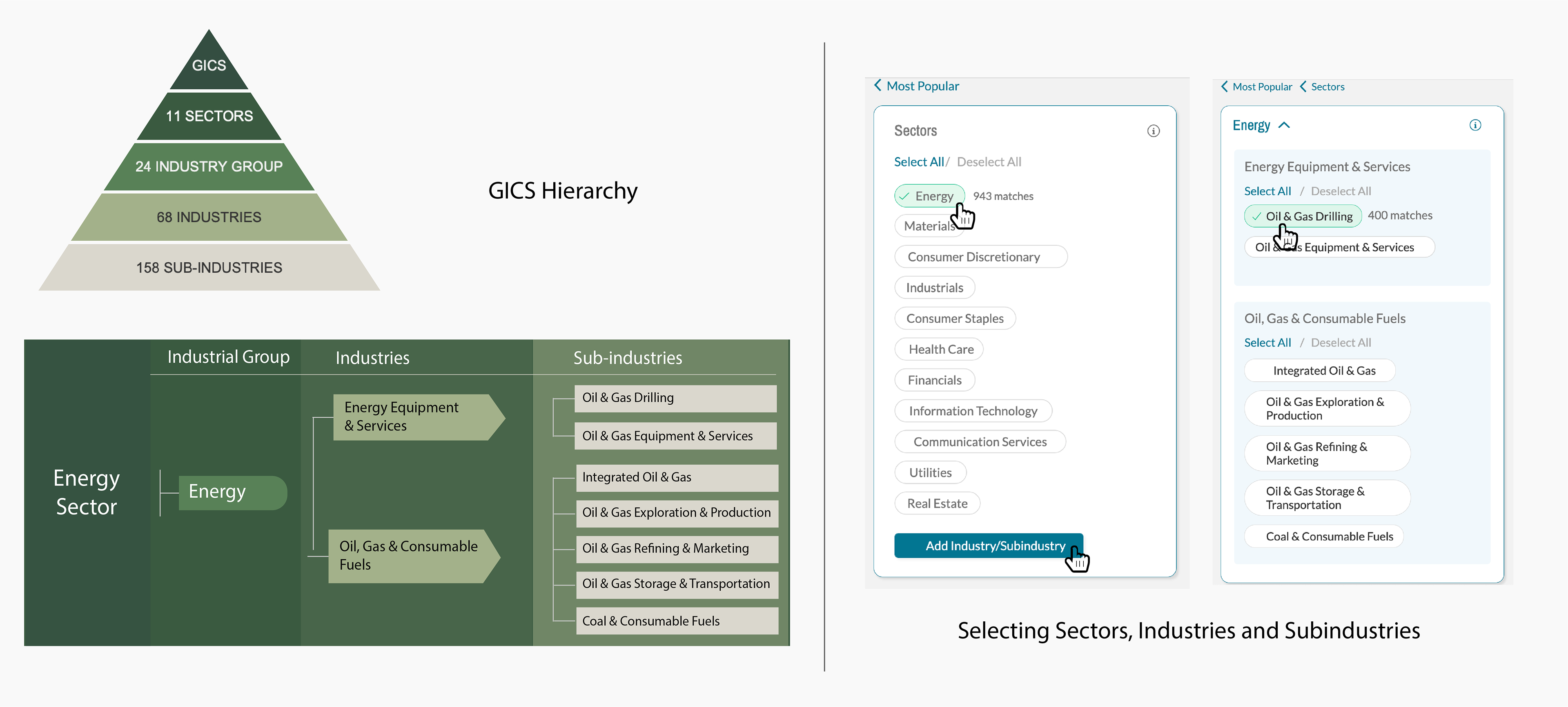
Simplifying sector and industry selection
Micro-interactions like selecting and editing criteria: The new design improves the convenience for investors in selecting and editing criteria. The filter selection process has been simplified by grouping all available inputs and allowing users to select a group instead of manually typing a number. The design also includes options to customize groups, edit and delete filter criteria, and clear all criteria to save time.
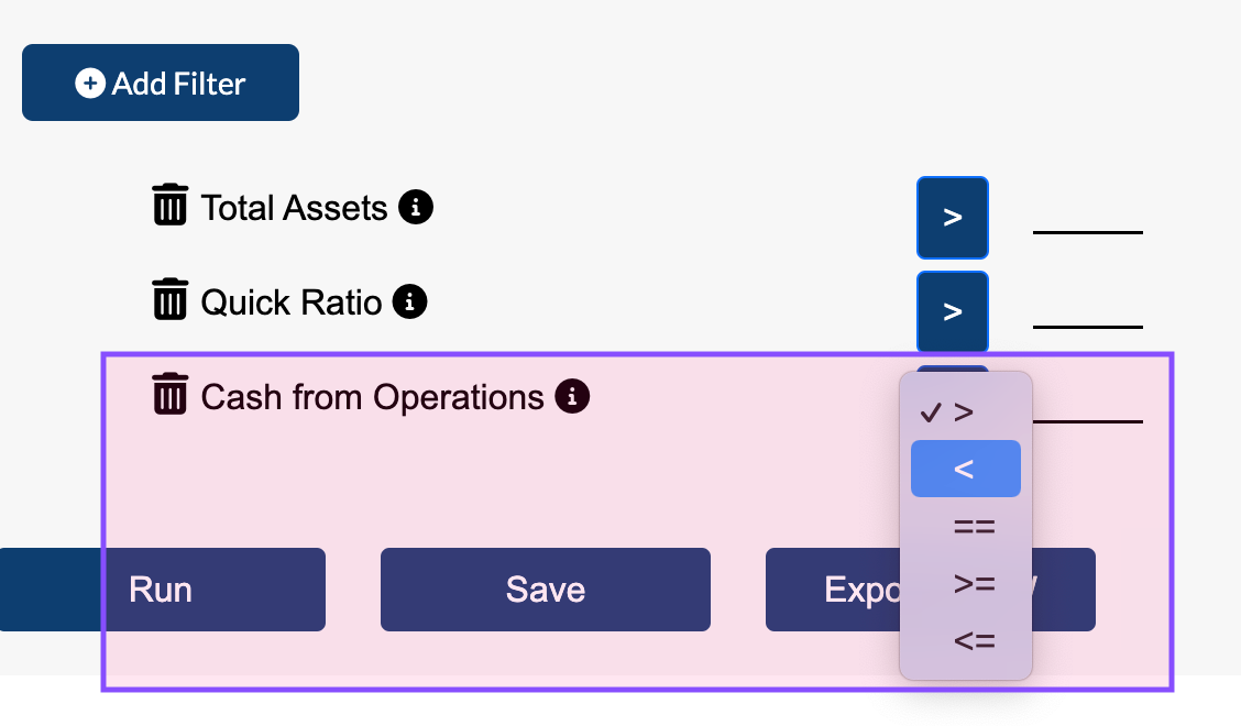
The existing input system makes investors think about what to do
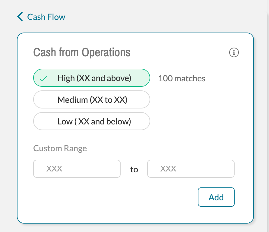
The new design made it easier to select a group and customize it
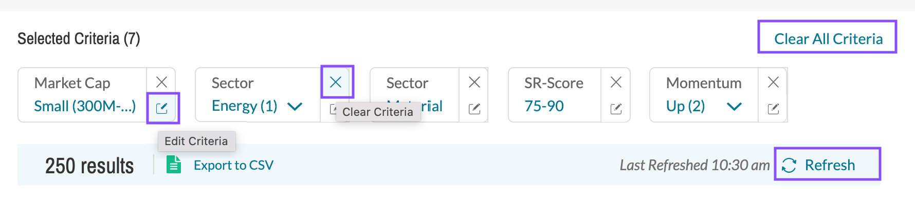
Assuring user freedom by paying attention to micro-interactions
Usability Testing
To evaluate the new screener, we performed 5 usability testing with investors who had medium to high investment experience.
• The new design received a user satisfaction score of 5.5 on a 1-7 scale, with 7 being the most user-friendly.
• Users found the filter category helpful, but 40% wanted to see additional technical criteria for short-term investment.
• 40% of users did not immediately find the "save screener" button, which was located at the top of the screen.
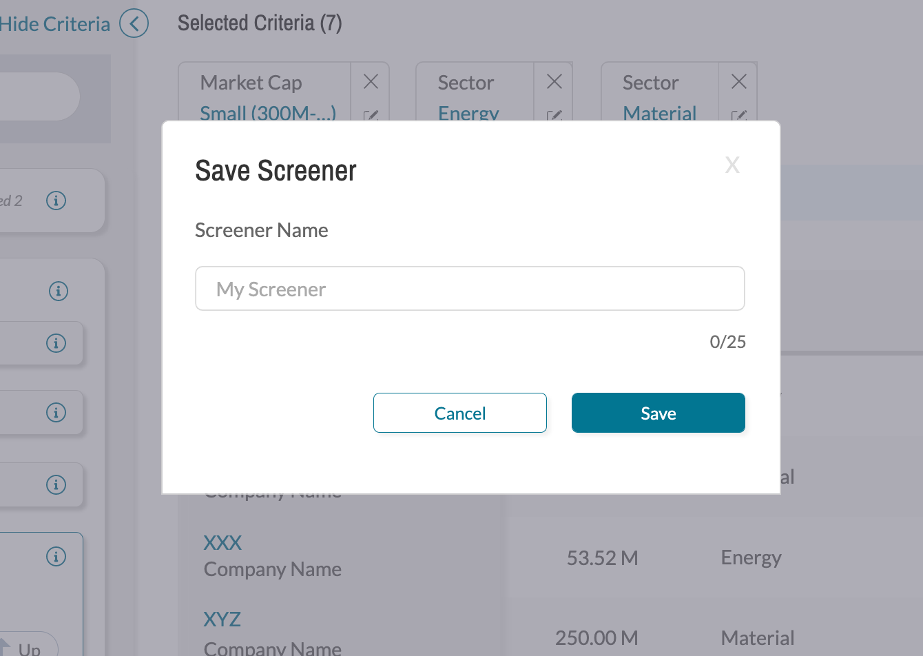
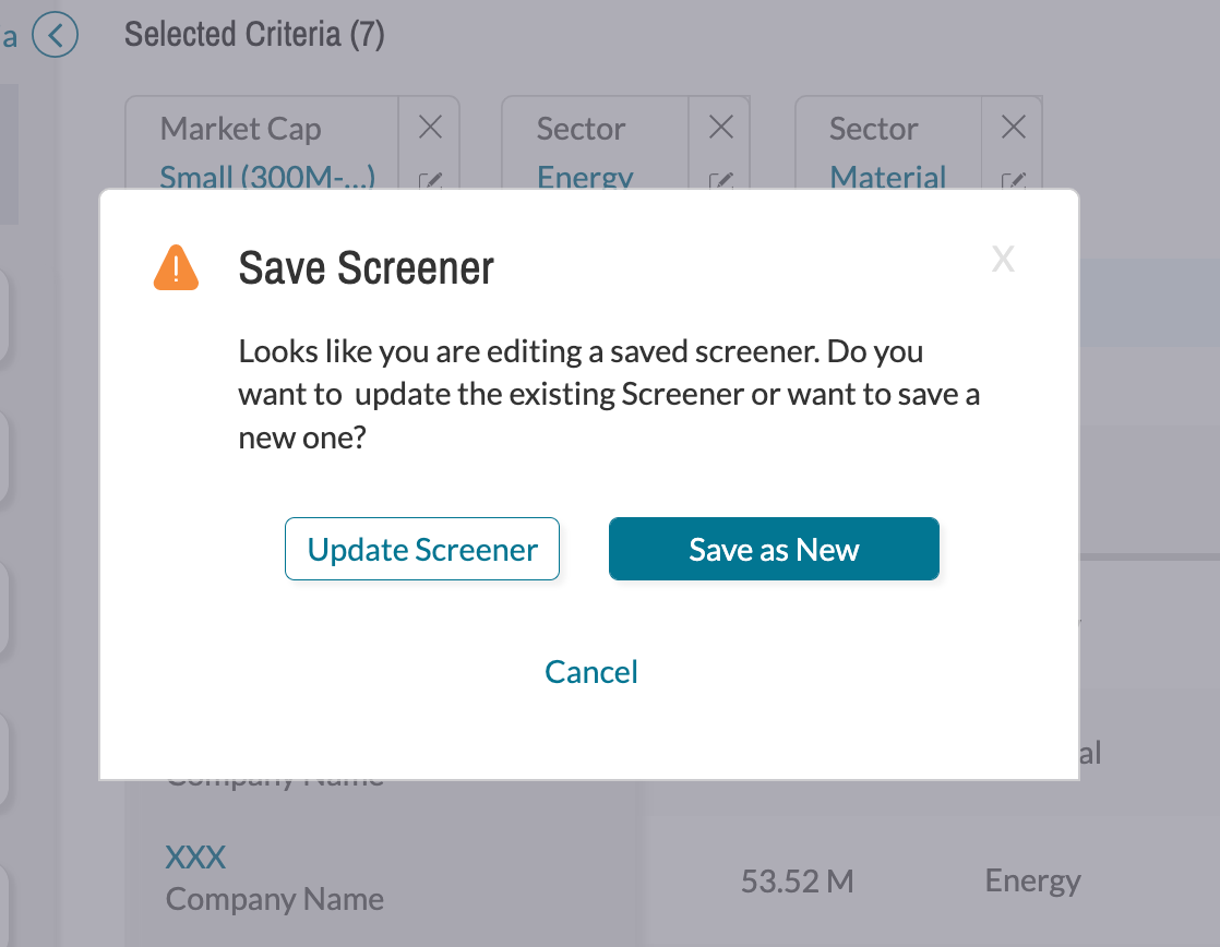
• 80% of participants preferred the option to overwrite an existing screener and create a new screener from a saved one, but the prototype only had one saving option per screener.
Final Design
The prototype needed to be updated based on the usability testing report.
• The "save screener" button was made more accessible by making it a floating button that sticks to the bottom, so it's always visible to users.
• Two saving options were introduced for updating or editing a saved screener. The new design allows investors to either overwrite the existing screener or save it as a new screener.
Old Screener vs New Screener
Current Screener
New Screener
What's Next?
The next step is to track and analyze the usage data of the screener after its launch. Based on this data, further improvements can be made to the grouping of available inputs in order to provide investors with more detailed information that aligns with their investment strategies. This will involve working closely with financial analysts and incorporating feedback from active users.
Reflection and lessons
The usability testing report has shown that the new screener design has effectively addressed usability issues by providing a more intuitive information architecture, improved search capability, effective filter criteria, and focusing on micro-interactions. However, in the process of finding the solution, I've learned that finding stocks thru a screener is not simple and may not be suitable for all types of investors. Different filter criteria may not be applicable to all investors. It was noticed that what may be useful for professional investors may not be useful for individual investors. The same filter criteria do not apply to all.
Beginner or novice investors might struggle with understanding the interrelationship between the criteria. An investment strategy can be changed over time. If I had the scope, instead of letting users pick filter criteria I would rather provide them templates with preset criteria associated with different strategies. That way novice users can learn about investment strategy easily and expert users can explore new opportunities without additional work. A stock screener is a powerful tool when used with the right research and techniques, it can open up many opportunities for investors.